View All Threads page
12
12
|
Administrator
|
I did a "View All Threads" page which you can see by clicking on the link from the homepage. Please check if it is okay.
|
|
I personally don't care for the category.
If you want the category I would suggest making it a separate column, right now the text runs together like a sentence and it's difficult to scan quickly. You can consider dividing the portion not for last post in half. Here's an example: 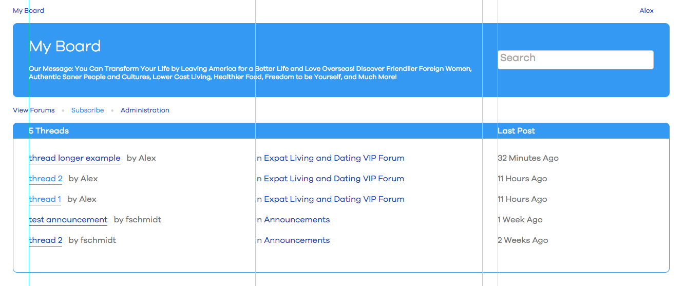
|
|
Administrator
|
You seem to be assuming infinite horizontal space. Let's pick a reasonable number, 1000px wide, and see what happens. First you have 100px margins on each side, so we are left with 800px. You also have 30px on each side of the table, so now we have 740px. I am giving 25% of the table space to the last column to make sure that the search box has enough space, and 25% of 740px = 185px. So we are left with 555px. I assume 30px between the columns, so with 3 columns that is 2*30px=60px. So we are left with 495px. I don't think that is enough for the "thread" and "forum" columns in your design.
I added a thread title from HA "Woman Murders Boyfriend Because He Was On Facebook Too Much" in the forum "Expat Living and Dating VIP Forum" in the test site. Try putting that into your mock with a browser width of 1000px. |
|
We have an infinitely stretchable space (your design not mine). At any given stretch there will be a character limit. You can cap the characters limit with some periods like "..." or you can wrap the text. This would solve your issue.
Your number isn't reasonable and doesn't reflect my design. My mock is 1200 px, so subtracting would leave us with 1000px. I think most websites have a wider content area than 800px. If you don't want to do a two column design with capping character limit you consider an alternative idea of putting board under it in small text like this: 
|
|
Administrator
|
This is simply a responsiveness issue. There no point continuing this thread until we resolve responsiveness. |
|
We decided we'll do three different designs for small, medium, large based on these numbers: http://www.blasma.com/responsiveness-td256.html
For large it will be a three column design. For medium I need to do more testing. Small will hold off till later. |
|
I've been working on this. We need to figure out a few things:
1. Our size ranges are: small = x-767px medium = 768-1199 big = 1200-x The sensible approach is to design based on the smallest number of each range, so: x, 768, 1200. It does not makes sense to design medium for example at 1199 if it breaks at 768. Do you agree with this? 2. Where do we draw the line between morphing and wrapping? I know you have a technical definition, but this is not what I'm talking about. As an example I think going from a 2-column design to a 1-column design is morphing. However if text in a 2-column design uses more than one row in either column then I consider that wrapping. Based on this thinking we do not want morphs to occur within sizes (small, medium, large), we only want wrapping to occur. If we follow the above two principles this may restrict us to a 1-column design in medium for all threads. And by 1-column I'm also disqualifying post time. You can see how this will have implications elsewhere. Here's an example: 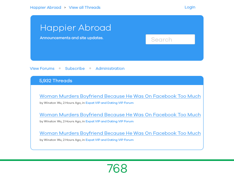
|
|
Administrator
|
yes Yes, this is the same as the technical definition. I am not sure if this is true. I would shrink the side margins. And I think it is okay if some thread titles wrap as long as most don't. |
The original design of board/forum was based on 1200px. The side margin was 1/12 of page width (100px) and 50% of top margin (50px). I realize that for small size it will need to be adjusted no matter what, so we are already being inconsistent. Are you okay with having different size margins for small, medium and large? |
|
Administrator
|
yes |
|
Do we really need the " .... in xxx forum" in the thread view?
In Nabble we used to have the child forums column in the thread view but I never cared which child forum a thread is. For people who care about the forum structure, they would navigate to the child forum. For people who want a thread view, they pick a thread and then drill down to the thread. So to me, it's either "Thread View" or "Forum View", a mix is never needed. |
|
I don't care about about what forum it's in either, but fschmidt wants it.
Assigning to fschmidt. |
|
Administrator
|
In reply to this post by Will Lin
Showing the forum is a convention to indicate that it is an "all threads" page. As long as you find some other way to make it obvious that it is an "all threads" page as opposed to a forum page, I don't care about the forum link. |
On http://www.happierabroad.com/forum/search.php?search_id=unanswered&sid=4d28557ca42d9d0493c70306ab52c2ce - I can barely see the forum information. So, I really doubt if that's telling me it's a threads page. I think the biggest visual distinction for the threads page is a the big undivided block filled by topic rows. Vs the forum page is a divided few blocks. 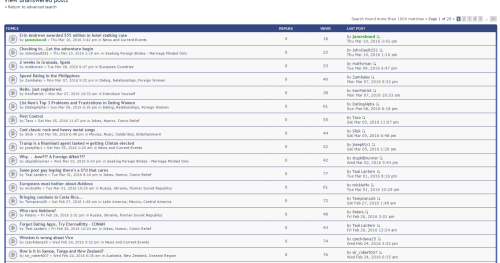 vs 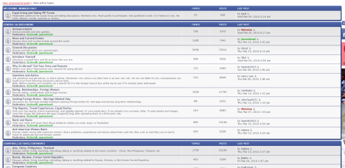 So, my point is that there is probably no need to do anything here. One little thing we can do, is in the thread view page, instead of
View Forums • Subscribe • Administration
We change it to:
< Return to View Forums • Subscribe • Administration
|
|
Administrator
|
You seem to be comparing All Threads with the home page instead of a forum page. (The images are too small for me to see.)
Anyway, I would be fine with making the "99 Threads" in the table header convey the difference. In a forum, it would say "99 Threads in This Forum" and for all threads it would say "99 Threads in All Forums". Okay? |
|
Yes, that will be fine.
|
|
Administrator
|
In reply to this post by fschmidt
So Alex, we can remove the forum links and do this instead. |
|
Ok keep on me.
|
|
Here are three mocks I made in conjunction for small/medium/large. We can start with just implementing medium but I wanted to show them together.
For small I did a few things differently. I then carried over these things into medium/large to keep consistency. First it does not make sense to have buffer space outside so this was eliminated. Second round corners only look nice with buffer space. If you want to see a bad example of this go to happierabroad on phone switch to mobile view. So I think rounded is unnecessary on phone. Last I think lines separating entries helps.  For medium I don't think there is enough space for putting author on same line. So my suggestion is to do two columns and always put author below title in first column. 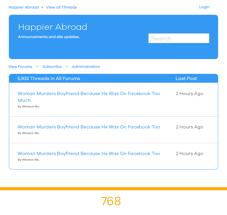 This uses a three column design. 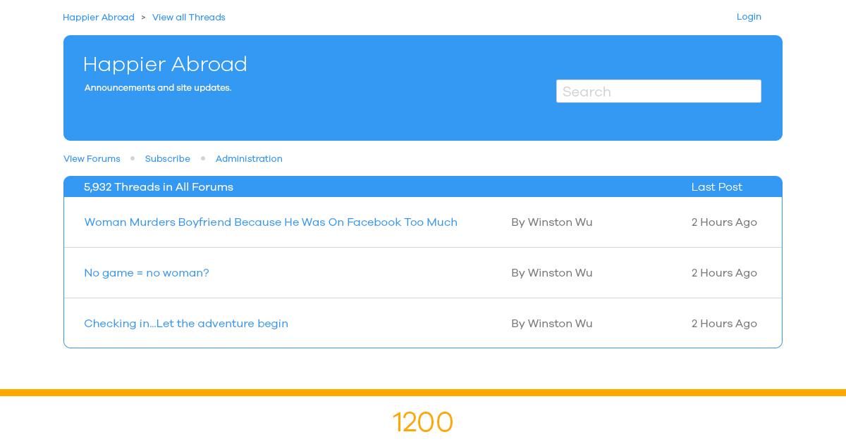 Please review. Once we are in agreement I'll provide specs. |
|
Administrator
|
This looks fine. I don't think we need the "Administration" option here, so you can remove it.
|
«
Return to Blasma
|
1 view|%1 views
| Free forum by Nabble | Edit this page |

