Alex K wrote
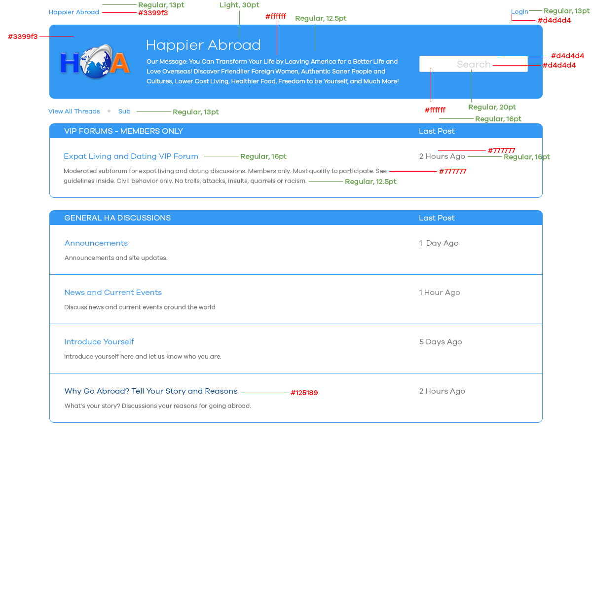
One thing I forgot to mention first time is that the text in search box is different, it is color (a9a9a9) instead of (d4d4d4) and it also looks like medium instead of regular. I'm not sure if you can control these things.
Which text, the initial "Search" prompt or the text that the user types? I assume the former, in which case I have no control over it.
Alex K wrote
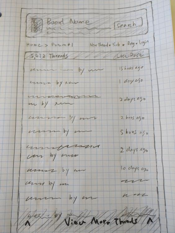
For the forum page:
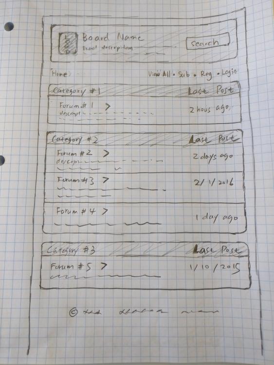
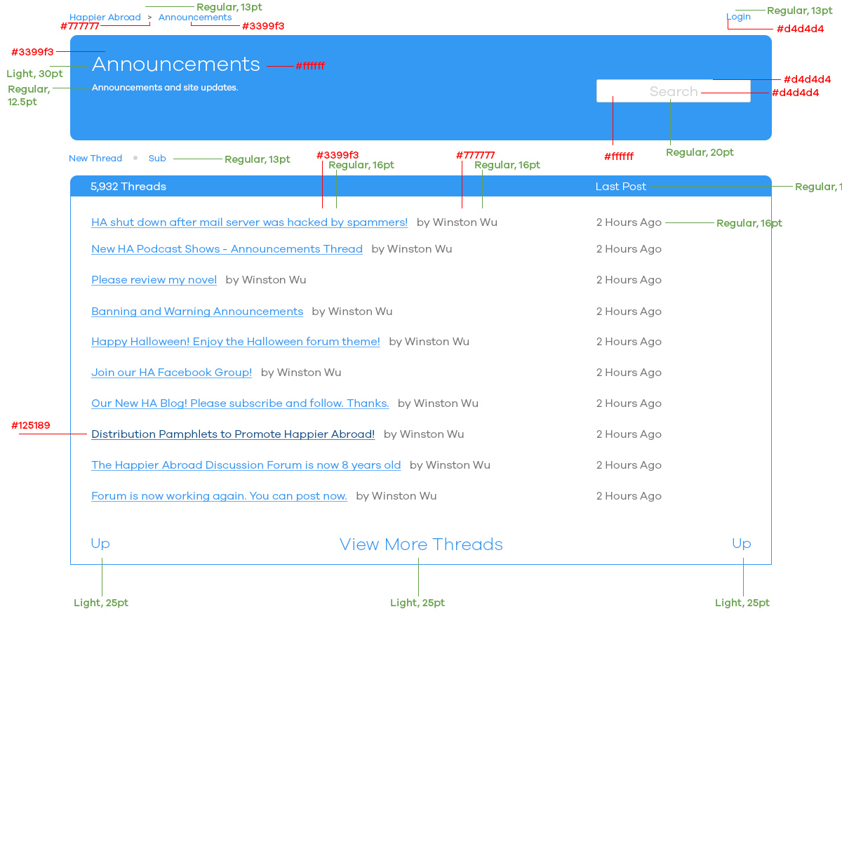
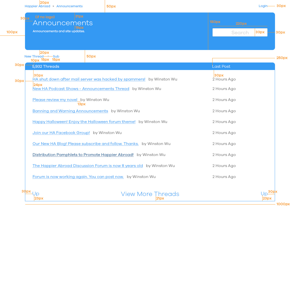
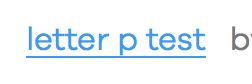
1. The line on the mock was intended as an underline like on
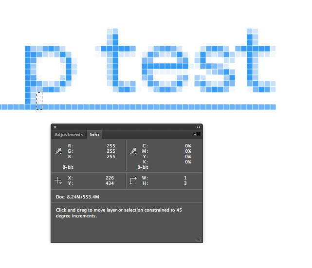
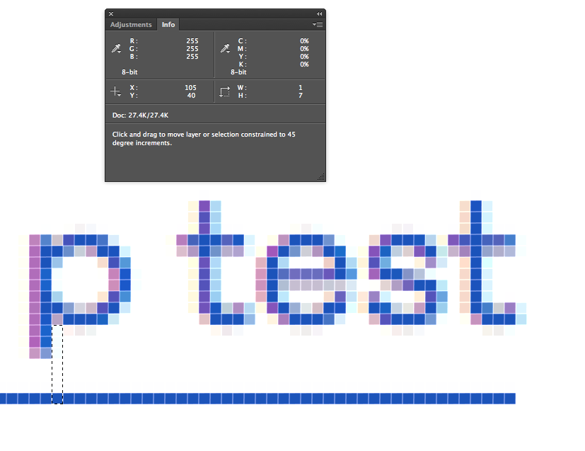
http://www.happierabroad.com/forum/latesttopics.php. At least this is what I think Will meant in his mock. On your forum page you seem to have two underlines, a permanent one and another that shows on cursor over. Neither the permanent one or the one that shows on cursor over matches the height in my mock. Your permanent is 7px under, your cursor over one is 2px under, mine was 3px under. I didn't label this because I just used photoshop's text underline tool and I assumed that was standard. You can decide what you want to do here, but the current arrangement is bizarre.
In your mock, the line is not 3px under, it is immediately under. Look for the "p" in your mock that touches the line. Mine does the same.
I implemented my line as a solid line, not an underline. The HA latesttopics uses an underline which is different in that it makes space for characters that go down. I currently use the underline when there is a mouse-over on any link.
I agree that combining them is confusing. I can either use my solid line and disable the mouse-over, or I can an underline whose position I can't control. Which would you prefer?
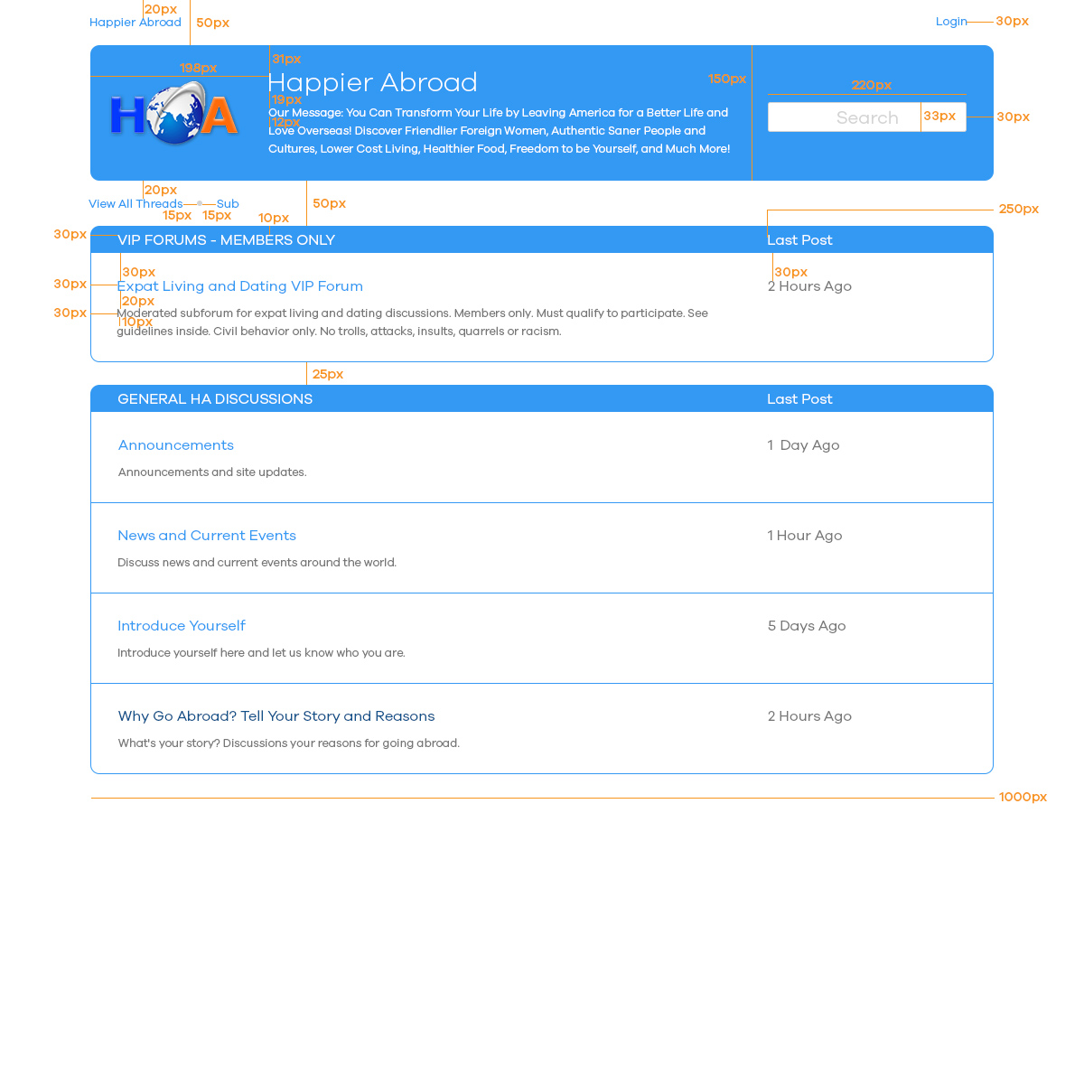
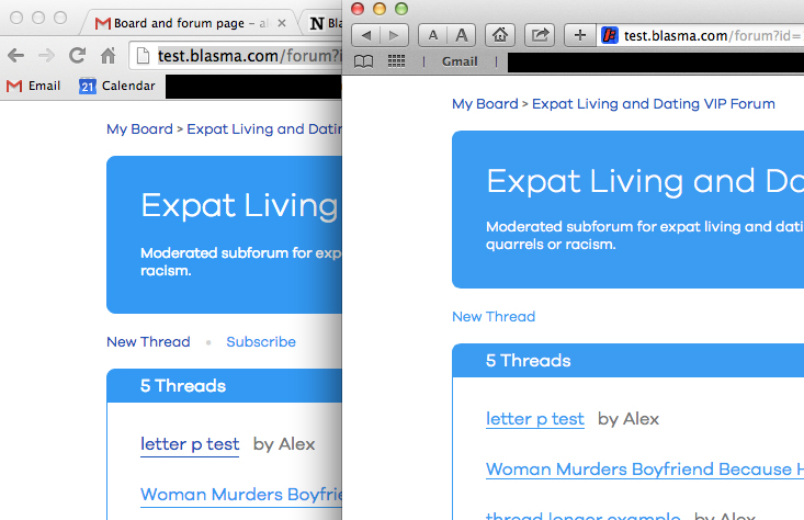
2. I labeled my mock wrong for the white space between each thread. My mock should of said 30px of white space between each row (same as white space to left). By between I mean from the bottom of underline on top tow to the top of text on row under.
fixed
3. I didn't specify this on the mock but it would be nice if the white space under last row was equal to white space above top row (this would be 30px again). In the current forum I don't see the "up" or "view more threads" so I won't comment on how to handle that scenario.
fixed